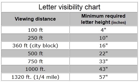
Letter Visibility
Choosing a letter-size based on visibility needs.
To determine what size lettering you may need for a vinyl lettered banner, window lettering, vehicle graphics, or any other sign for that matter, you'll first need to consider from what distance the information needs to be seen. Some signs only need a few feet of visibility, like decals or magnetic signs, to effectively impact their target audience; whereas, other signs like over-the-street banners, need to have extra-large letter visibility than can be seen from miles away.
Every Inch = 30 Feet of Letter Visibility
(Letter visibility determinations are based on dark lettering, upon a plain white background, under clear weather conditions.)

Letter visibility can also be affected by text color, background color, and font choice as well.
COLOR VISIBILITY: For instance, if you choose two dark colors like red text on a black background, the contrast level is very low so your graphics will be very hard to read from a distance. On the other hand, choosing a dark text on a light background can be viewed from long distances because the darker text has a high contrast value against a lighter background color. Also, keep in mind that very light colors on a light background may also be hard to view from a distance. For long-distance viewing, it's always best to go with light and dark color combinations that will accentuate the letter visibility of the sign information.
FONT VISIBILITY: Basically font lettering is broken down into a few different characteristics to identify typography. You will commonly hear the terms serif, sans serif, and script when it comes to typefaces. The difference between serif and sans serif is usually very slight and is characterized by a small line attached at the end of a stroke of the letter; whereas, sans serif fonts are "sans" (without) extra lines strokes. Script fonts are typically very delicate, elaborate, or fancy and mostly resemble cursive handwriting. Serif and sans serif fonts carry to most impact for letter visibility; while script fonts have a nice and elegant look up close, but lose their readability from even small distances.
One other thing to consider for letter visibility...
SPACE AVAILABILITY: Most all fonts are roughly as wide as they are tall. So a 2-inch tall letter is approximately about 1.75 inches wide. For signage that requires big text for maximum letter visibility, you will need to make sure you have enough room to accommodate your intended design. And while calculating your available space versus letter size and letter visibility involves some math, it's better to be safe than sorry, so make sure your sign purchase is effective and done correctly the first time. (Example: You have determined that you need your banner text to be seen from at least 200 feet away so you will need 7-inch lettering to achieve that letter visibility distance. Your text reads "NOW OPEN", so since a seven-inch letter roughly measures seven inches in width, you will need at least an 8-inch by approximately 56-inch space to display that lettering without an issue.)
For more information on letter visibility, or help with determining your sign needs,
give us a call and consult with our sign experts.
Local: 714-573-9313
or Toll-Free: 866-267-4467
